A Fresh New Look for WWYC!
CLUB
8/15/20251 min read
We recognised the need for a look and feel that not only captures the spirit of our club but also works effectively across all platforms—from our burgee to social media. And we did it by keeping things in the family! The new design was skillfully crafted by Tom Rogers, son of our current committee member, Andrew Rogers. Tom developed a cohesive visual identity to offer more value and sense of belonging to every member.
Having a unique, recognisable brand makes it so much easier for us to do things for the club, whether we're creating merchandise, putting on events, or especially when boosting our social media and digital reach. An updated, welcoming appearance is key to securing new members and showing everyone what a dynamic club we are.
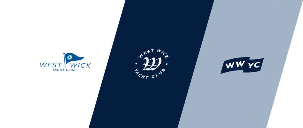
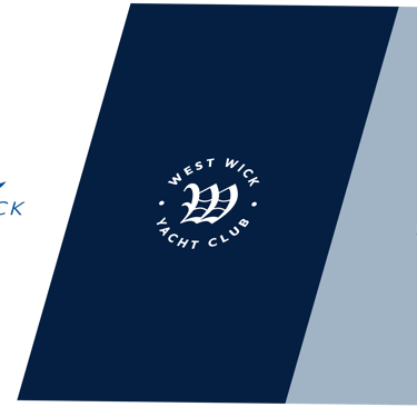
Meet Our New Logo Family
The rebrand includes a set of three distinct logos, each designed for a specific purpose:
Logo 1: The Formal Standard. This is an update of our original design, reserved for more formal settings, and proudly features the club burgee.
Logo 2: The Club Icon. This is the symbol you'll see the most! It's our primary, instantly identifiable icon that will become synonymous with the WWYC.
Logo 3: The Heritage Mark. Used for special applications where history, tradition, and our esteemed members are being presented, awarded, or highlighted. This logo celebrates our rich past.
We're incredibly excited for you to see the new brand in action! It’s a bold step forward that reflects our commitment to a vibrant and modern club experience.

Visit US
Connect WITH US
North Fambridge,
Chelmsford CM3 6LU
SITE MAP
© 2026. All rights reserved.